
When national juice bar franchise, Boost announced a competition to redesign their cup designs, I thought I’ll give that a crack.
With a large national footprint and a Boost Juicebar in pretty much every major shopping mall in Australia, the opportunity to get a Doodles in Transit design into the hands of every juice lover in Australia was a no brainer.
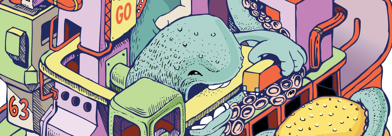
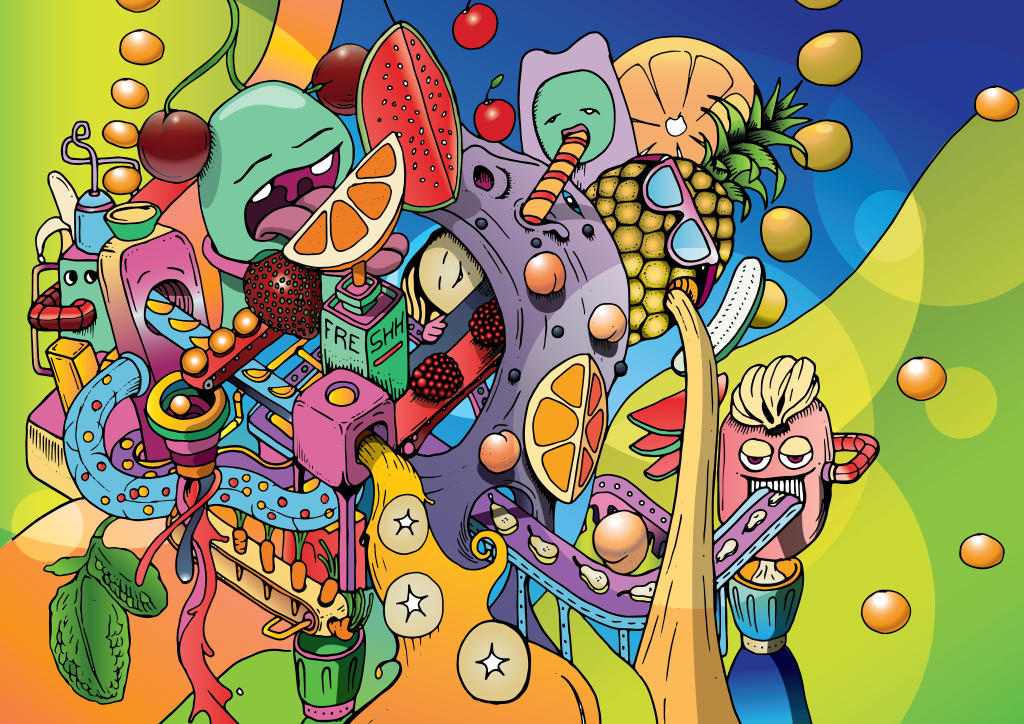
I wanted to create an in your face explosion of colour that was all about fruit but was unmistakable as a Doodles in Transit original.
The process started with some simple hand sketched elements and then I inked in the black line work which would later form the basis for a digital illustration.
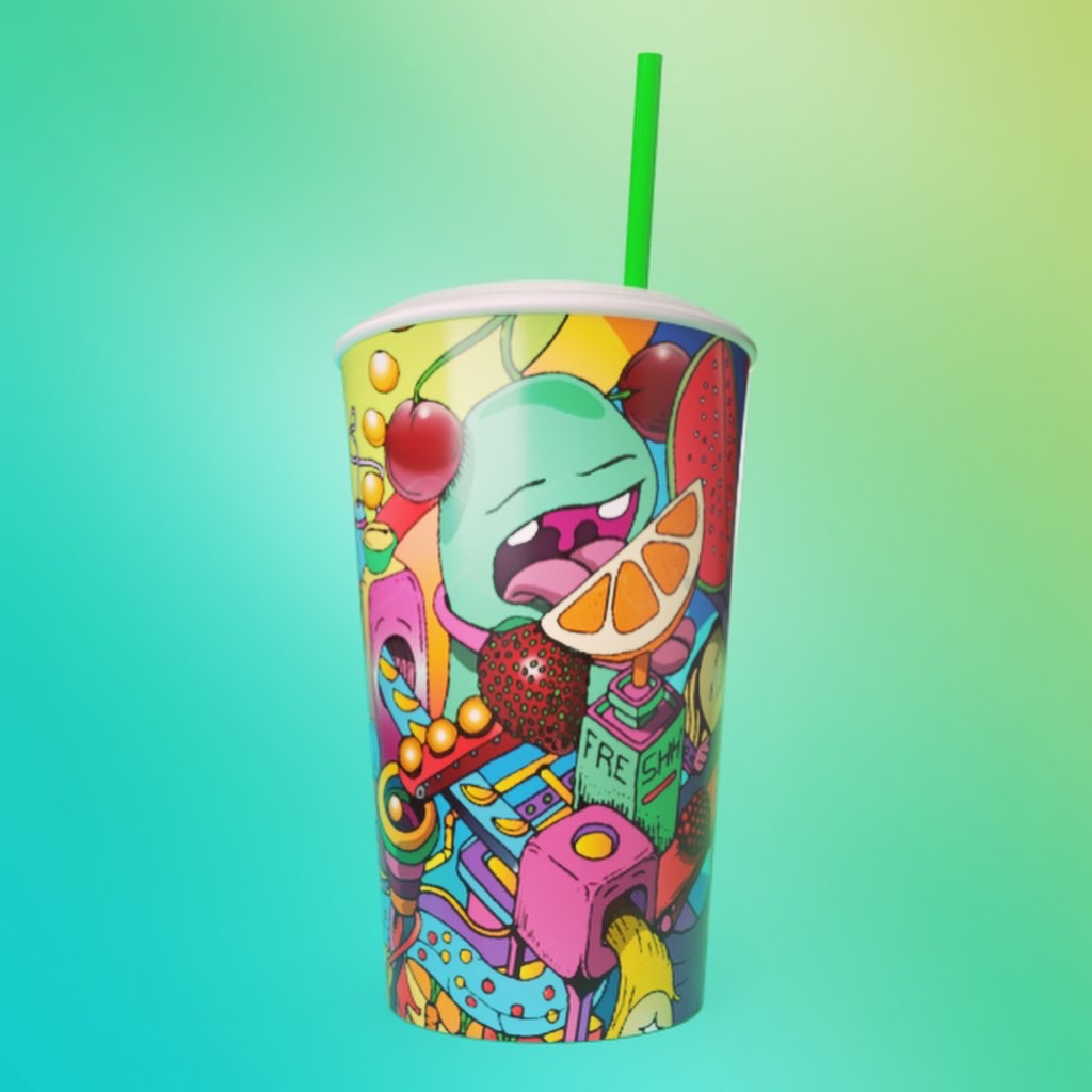
Once on the computer I created my colour palettes using image references and digitally colored using Adobe Illustrator. This gave me the final illustration which is then dropped into the cup template which forms the cylindrically wrapped cup art.
After getting all the artwork files together I thought it would be nice to get a visualization of what the final cup might look like so I used Adobe Dimension to quickly create a cup and map the artwork onto its surface. 3D is not my forte but this app keeps it very simple.
Boost announces the selected winners (3) at the end of April so I’m crossing my fingers they want to take a chance on my concept. Whatever the outcome I’m happy with my attempt and think it actually works really well in its final cylindrical form.

Love this Jamie 👌🏼 🍇 🍈 🍉 🧃 hope ya win mate.. you deserve it yo! 😊🤞
LikeLike
Hey thanks Nicole! All fingers crossed 🤜🏻👍🏼
LikeLike
That’s wicked!
LikeLike